As I pointed out in a previous post, Lean thinking has influenced and inspired the DevOps movement. Taking this further, one of the fundamental techniques of the Lean movement that is extremely useful in DevOps is Value Stream Mapping (VSM). What is Value Stream Mapping? Value Stream Mapping can be briefly and simply described as a tool that allows you to visualise the process throughout the value chain, from the moment an item is requested until it is delivered to the customer.
When I described the first principle of DevOps, “Accelerate Flow”, I introduced the relationship that VSM has with this principle: To be able to accelerate flow, the first thing that needs to be done is a detailed analysis of the actual flow of our work items along the value delivery process. Value Stream Mapping will allow us to identify where the waste and bottlenecks are. It is worth remembering at this point that waste is defined as any activity that does not add value to the product, such as queuing time.
There are different techniques for creating a Value Stream Map, but after years of experience using this technique, I explain below the formula that has worked best for me:
How to create a Value Stream Map
The aim of a Value Stream Map is to identify and visualise the process that requests follow along the value stream. Therefore, the first thing that we have to identify is what a work item is. We need to define the item that we are going to trace throughout the process. In a DevOps environment, this item can be a specific function, a user story, an epic, etc. The important thing is that the item has been defined. At this point, it is interesting to remember that one of the basic pillars of DevOps is to make frequent deliveries, so the bigger the item is, the more we will be moving away from the DevOps philosophy.
Once defined, we should draw the stages through which this item is going to pass. I personally recommend using a physical whiteboard before using a digital tool. Once we have the map, we can transfer it into a tool.
To create a good Value Stream Map, it is advisable to physically visit the locations or people through which the item passes and check which activities are carried out on the item, critically evaluating which ones add value and which ones do not.
In this phase, it is essential to measure the time that the item spends in each stage and carefully record those times. For this activity, I recommend using Post-it® notes and placing them on the whiteboard prepared in the previous step, recording, depending on the process, the date and/or time that the item entered a particular stage. This data will help us calculate the process’s cycle time, a fundamental KPI for DevOps.
Another indicator that we can obtain is the actual work time versus the wait time and calculate the efficiency.
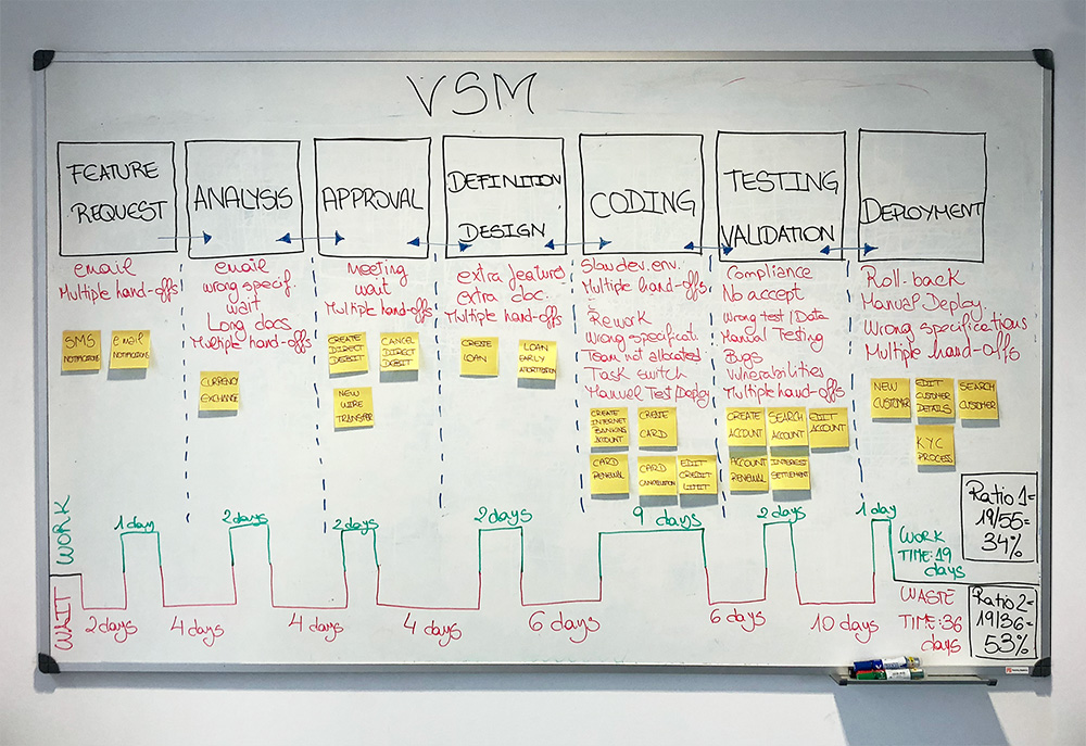
For example, from the value stream for a traditional development process, we could create a Value Stream Map on a whiteboard as in this simple example:

Figure 1: Using a whiteboard to create a Value Stream Map
We can see that, as defined by the process, the delivery time (from the moment the customer places an order until it is delivered) would be 55 days.
This example is very simple, but it can be easily adapted to the typical flow in a software development company. Although the times may seem exaggerated, it perfectly illustrates how working in silos with different teams negatively impacts the cycle time, since the wait time is generated because of the difficulty synchronising between teams.
How to analyse a Value Stream Map
Looking at the map, what analysis could we extract?
- We can visualise and analyse where the waste is and where to apply suggested improvements. For each stage, the activities carried out could be analysed to see which deliver value and which are simply waste.
- How the cycle time would be affected by including an automated Deployment Pipeline. Ideally, the wait times from development to deployment would be reduced, so that the 22 days spent waiting (independent of other problems that may arise) could disappear. This does not mean that the cycle time would be reduced by 22 days (it could be even more), as a complete flow change, and therefore a change to the Value Stream Map diagram, would be required.
- How it affects reducing work in progress (WIP).
- How to apply Theory of Constraints (TOC) to improve process flow.
These are some examples of the usefulness of Value Stream Mapping, but each organisation must analyse its own flow according to its processes and resources.
What is common to all is that any company that wants to undertake the transformation to DevOps should begin by creating a Value Stream Map of its processes, analyse it and start with the suggested improvements that accelerate this value stream.
Using JIRA to visualise the Value Stream Map
Once we have created our Value Stream Map, we can use a tool that helps us visualise and measure our value stream. You can use any tool that allows you to display digital boards and measure the time the items spend in each column.
In this case, we are using Jira Software because it allows us to define the work items, create the workflow and map the flow stages to a Kanban board, which provides us with a graphical visualisation of the process.
The example that we described in the previous section could be mapped as follows:

Figure 2: Kanban board of a software development process
In this Kanban board, we have transferred the same stages that appear in the Value Stream Map, turning them into columns, and we have created a workflow that allows us to move the items on the board. In this way, we can visualise how our work items move along the value stream
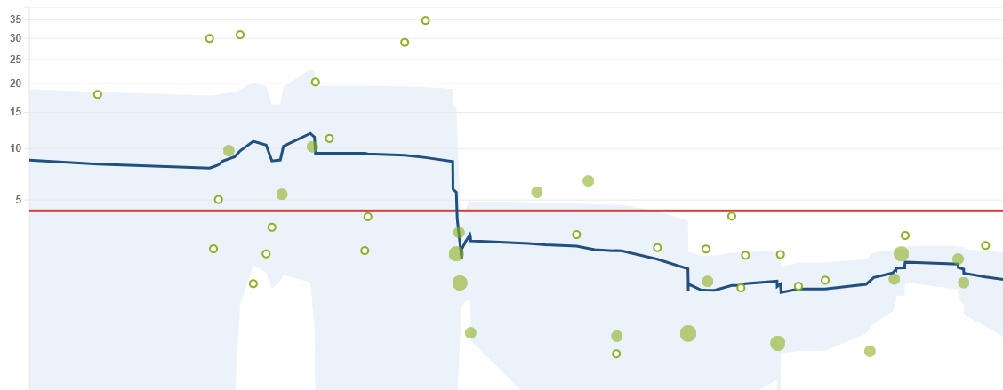
In addition, Jira Software includes a reporting feature that allows us to obtain the cycle time very easily and monitor the changes introduced to the system. This utility is the control chart.
We can see an example in the figure below:

Figure 3: JIRA Software control chart
In the chart, we can see the change in the cycle time as well as its variability.
Each dot on the chart represents a work item, for example a user story. The red line represents the average cycle time for the entire period shown, while the blue line represents the rolling average, which shows us the variations in the cycle time. A descending blue line means a reduction in the cycle time, while an ascending blue line represents increases in the cycle time. Finally, the blue shaded areas represent the standard deviation of the data, so that the narrower this area is, the less variability and more accuracy we have in our system, which leads to more accurate estimates.
We can use the control chart to assess whether the changes we make to our system have managed to reduce the cycle time. In this case, we can clearly see that the measures introduced have worked, significantly reducing the cycle time.
Conclusion
In this article, we have briefly described what Value Stream Mapping is, how to develop a Value Stream Map for our processes, how to interpret it and finally how to use a tool to help us record and track it.
The main benefit of Value Stream Mapping is that it allows us to find out what our organisation’s value stream is, highlighting the problems, waste and bottlenecks, which helps us develop effective improvement plans with the objective of reducing cycle times in delivering value to the customer.
It is important to stress that producing the Value Stream Map is a continuous improvement task that has to constantly evolve as we introduce changes to our value delivery flow.
In upcoming posts, we will look at what techniques we can use after analysing the Value Stream Map to try to reduce cycle times. Follow us on LinkedIn and Twitter so you do not miss any of them.
Emiliano Sutil is a Project Manager at Xeridia


